   News
   News Archive
   Downloads
   Articles
   Links
   --------------------------
   The Games
    - The Pawn
    - The Guild Of Thieves
    - Jinxter
    - Corruption
    - Fish!
    - Myth
    - Wonderland
    - The Magnetic Scrolls
       Collection Vol. One
    - The Legacy - Realm
       Of Terror
   --------------------------
   Magnetic Interpreter
   --------------------------
   The Message Board
   Guestbook
   --------------------------
   About The Website
   Contact
|
| The
Arts That Spell Adventure - Page Two |
| written
by Mike Gerrard for "Atari ST User" magazine 03/1988
(used with kind permission) |
|
In fact,
none of the several artists the company uses have been trained
in computer graphics. They all have conventional artistic backgrounds
and experience and are then trained in the use of the ST.
"All
our artists work initially on the ST", Anita explains,
"because that was the second version of The Pawn that we
did, after the text-only QL version. At that time the Amiga
was just a twinkle in someone's eye, and we already had the
ST and a copy of Neo so we just got on with it and it's worked
perfectly well - so why change it?
I'd like
to say it was all planned and everything was carefully evaluated,
but nothing about Magnetic Scrolls has ever been planned! The
artists are only brought in when the adventure itself is fairly
well-advanced, when the room descriptions are more or less complete
and the exits and objects for each location have been almost
finalized.
"Ideally,
two artists would be involved in producing the 60 or so original
ST screens that would make up a typical adventure, but this
can increase to four or five because of the pressure of deadlines.
The artists are called in and talked through the game, and they
choose for themselves which locations they want to illustrate.
|
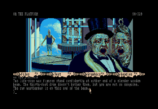
 On the platform with the rain weatherman
|
|
"I
strongly believe that the only one who knows about art is the
artist", says Anita Sinclair emphatically. "The artist
will then be given a complete revealed location for each of
the graphics that they're going to be working on.
"This
tells them absolutely everything that's relevant to the place:
Objects, exits, weather, general feel and atmosphere. No memory
or other restrictions are given, and the next thing Magnetic
Scrolls will see will be the finished screens. "Admittedly
I do tend to snarl at them if the pictures don't compress too
well", says Anita, "but basically the only technical
restraints that we give them are the size of the screen, and
even that they can go a little bit over if they like.
|
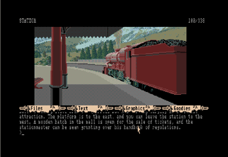
 Is this the end of the line
|
"They
do know though, that we'll always drop pictures rather than
text if we're pushed for memory. It's much simpler to save a
chunk of memory by dropping a picture than by having to try
to alter the text, which can start to affect lots of things.
We had to drop two pictures on the ST version of Jinxter, for
instance, because we ran out of disc space."
Geoff Quilley
seems to thrive under such constraints: "When I've got
the gist of the game, I choose the locations I'm going to illustrate.
I have got certain interests in drawing, and that probably influences
the ones I choose.
"For
instance, if you look at some of the rooms in The Guild of Thieves,
you'll see that the architectural styles tend to preoccupy the
most. I find that interesting to do, and obviously I'd probably
choose anything with dramatic potential as well.
"I
tend to do lots of little sketches first, mostly pencil, just
to work out ideas, check out perspectives and so on. Occasionally
I will also go into quite fine detail in a sketch to enable
me to see how things will look.
|
|
"I
can make suggestions to the adventure and change things around
a little - if I felt it would be better to make a room a different
size or shape, for instance.
"When
I finally move on to the ST I use Neo, which I find quite adequate
for my needs. I did look at Degas, but it didn't seem to have
any advantages as far as I was concerned. There were a few little
extras, but they seemed to be things I'd maybe use once a year
at the most, so it didn't seem worth switching.
"I
use a lot of soft colours, for pastel-like effects, and that's
because one of the problems I find in illustrating things is
with the colours. Bright colours seem to me to be too bright:
They almost leap out of the screen at you and that makes it
difficult to maintain a balanced picture, so I generally tend
to prefer the more subdued look.
"I
did eventually think my graphics for The Pawn were better than
most other stuff around at the time. It seemed obvious to me
there were very few people doing computer graphics who knew
very much about the art side of things, about colour and perspective
and so on.
|
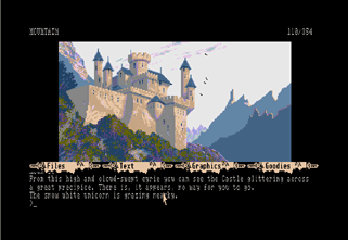
 A gothic castle fills this peaceful mountain scene
|
Previous
Page / Next page
Back
to Articles page
|


